- Scope:
Branding
App design
Animations
Micro interactions - Role:
UX/UI designer
- Scope:
How might bring more visitors to DESPHO while keeping a high quality profile?
My Process
01 Research
- We ran a competitor analysis to see how other players inform visitors about their festival and if they use similar tools. During the research emerged that direct competitors aren't usually developing applications. On the other hand, indirect competitors, such as film or music festivals, are keener to provide applications.
- We interviewed an informed user base who has already attended a photo festival. Interviewees indicate that the most important features are: an easy and quick booking process and a perfectly organized logistic system. They also added that information should be organized effectively, and the artist's details should be accessible and easy to read.
02 Empathize
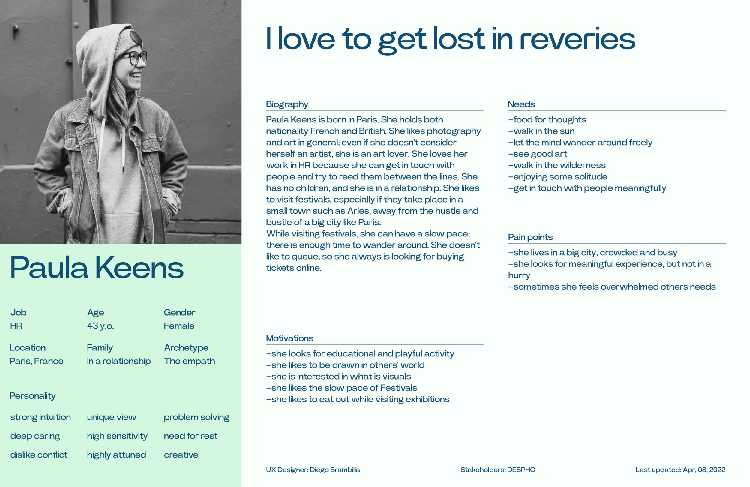
Creating a persona allowed me to empathize with our target and ground the design into wishes and needs that emerged in the interviews. My target group were people who had already visited photo festivals; this was crucial to discover precious insights.
03 Define
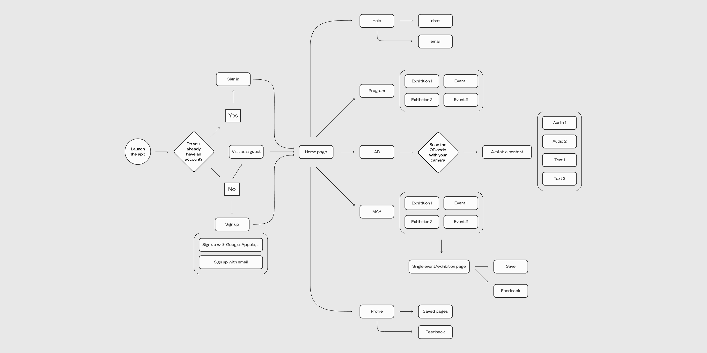
Before starting to design the app, we first explored the information architecture—how the content is hierarchically organized. Then we considered flaws that users follow while navigating the app. This part was essential to take into account all the practical aspects of an app meant to help users visit a festival.
04 Design
We started to develop the branding focusing on the idea of non-animal life forms. In this sense, the color palette includes two secondary colors, blue and yellow, which combined give green, the most common color amongst non-animal life forms.

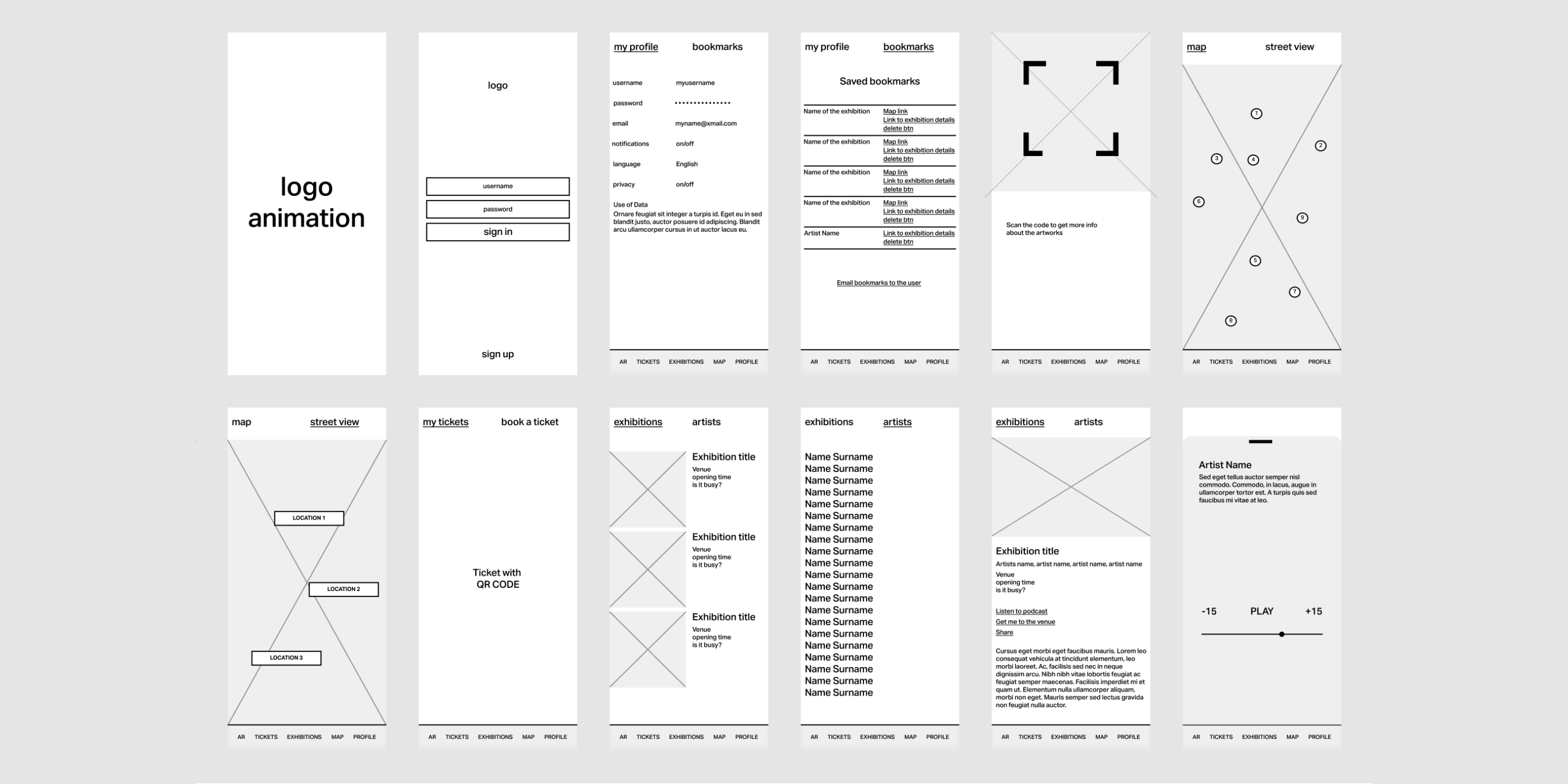
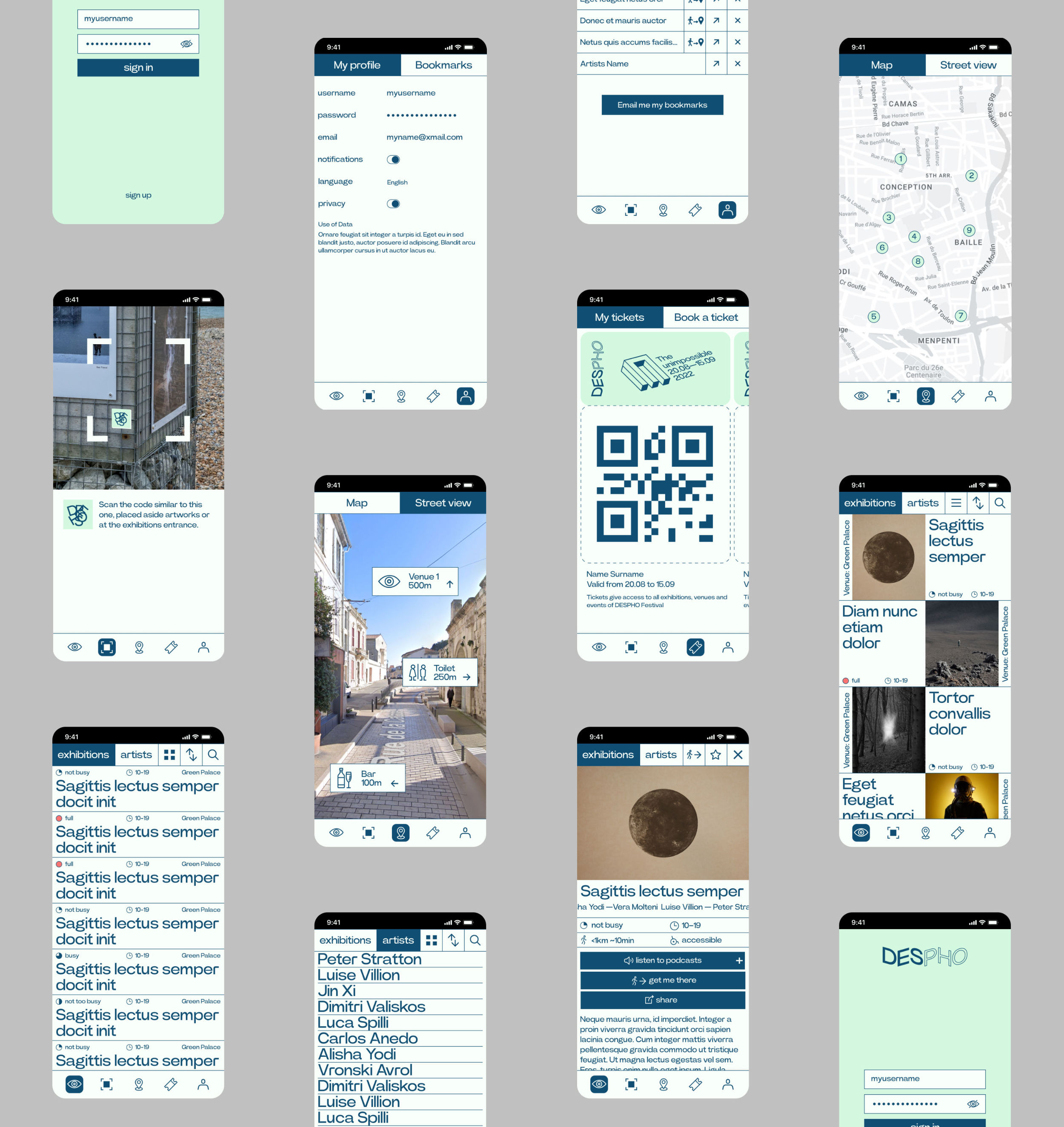
- We developed a design that matches a typography-based style with features that make the festival's visit an easy and smooth experience—no need to learn to use the app; everything is intuitive and flawless.
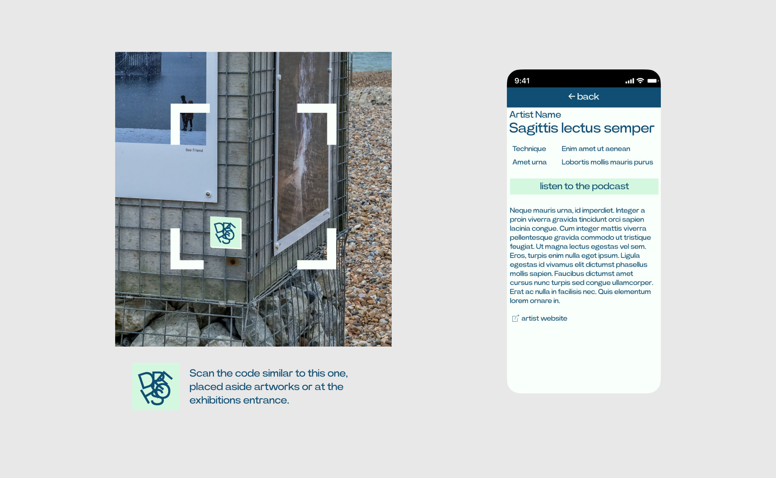
- Moreover, all the artworks present a sort of QR code below. If users point the camera at them, they can access info about the artworks and artists, both written and audio content. All those features are explained at the entrance of each exhibition.
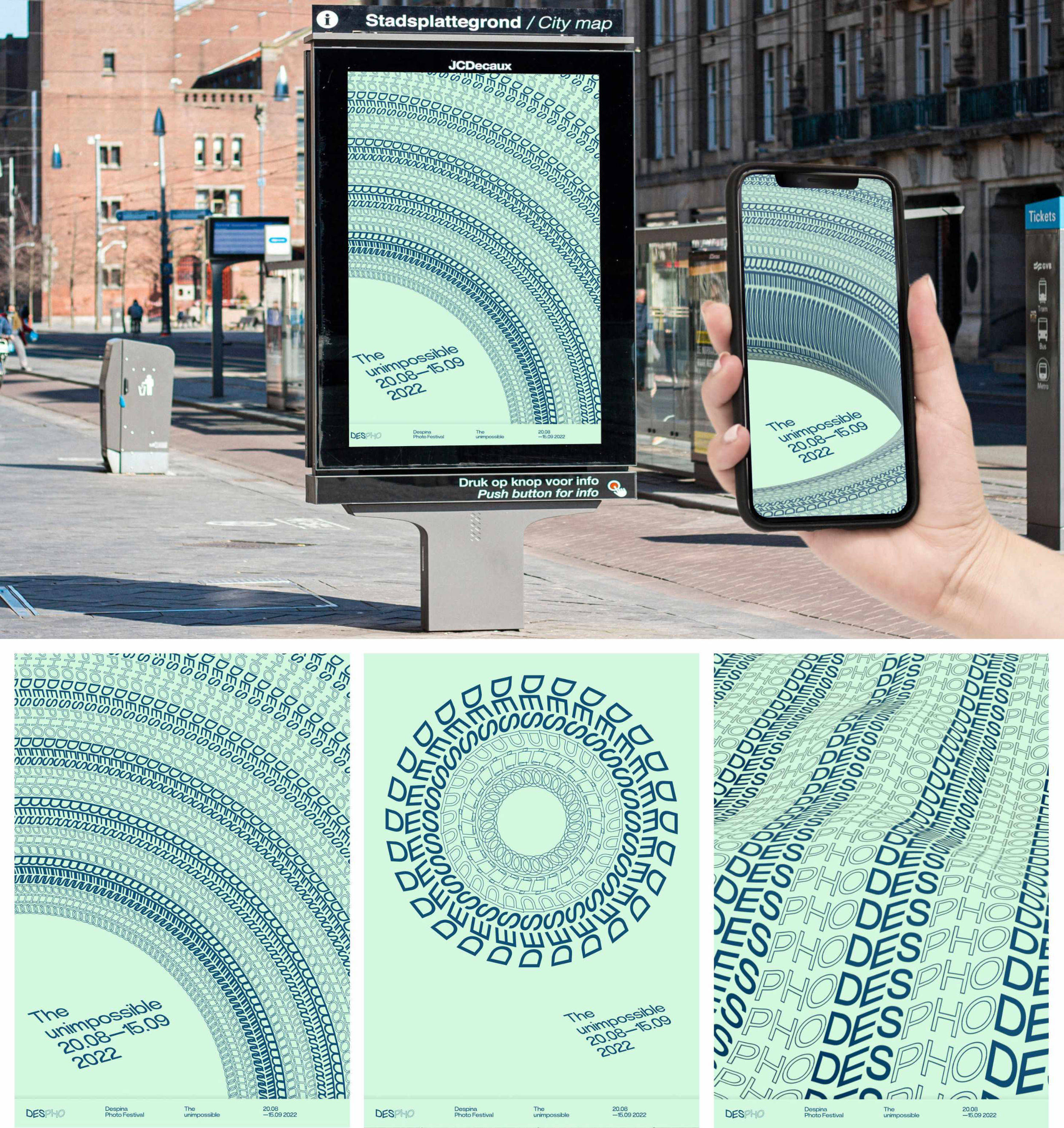
- We integrate Augment Reality functionalities to entertain users while visiting the festival. All the posters are reactive, meaning that a new shape emerges if a user points the camera at them.
- Moreover, all the artworks present a sort of QR code below. If users point the camera at them, they can access info about the artworks and artists, both written and audio content. All those features are explained at the entrance of each exhibition.

05 Usability test
The prototype has been tested by a group of potential users and experts. We made all necessary modifications to reach a mature phase, ready for the handover with developers.
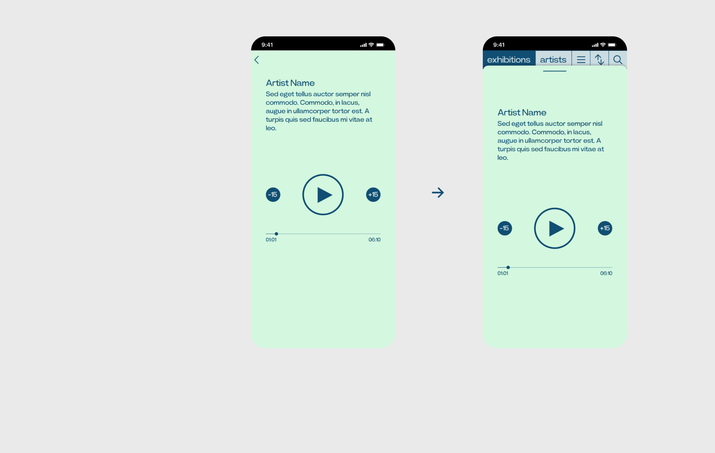
The bottom and top drawers were not intuitive, so they were redesigned.
- Moreover, all the artworks present a sort of QR code below. If users point the camera at them, they can access info about the artworks and artists, both written and audio content. All those features are explained at the entrance of each exhibition.
